Branding and packaging that tells an engaging story
Back in 2013, a borehole was installed at Marlish Farm which was initially used as a sustainable water supply for grazing livestock. Shortly after, Marlish realised that there was a gap in the market for a regional, independent spring water brand with a completely sustainable resource.

Who are Marlish Water?
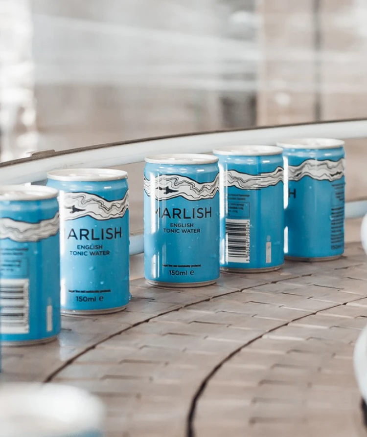
The rainwater which falls on the Northumbrian hills takes hundreds of years to filter through the rock strata, gaining its high level of purity along the way. A factory was built on the farm so that the purity of the water could be preserved and also so their products could be packaged at source to reduce their impact on the environment. JUMP began working with Marlish in 2017 and we have since built a close relationship. We were faced with the challenge of rebranding a local company with very little market presence.


From the initial meeting, we knew that JUMP ‘got us’, understood the marketplace and shared our strategic vision. They continue to be the perfect extension of our team.
Joseph Evans, Managing Director


Creating a brand identity ready for innovation and growth
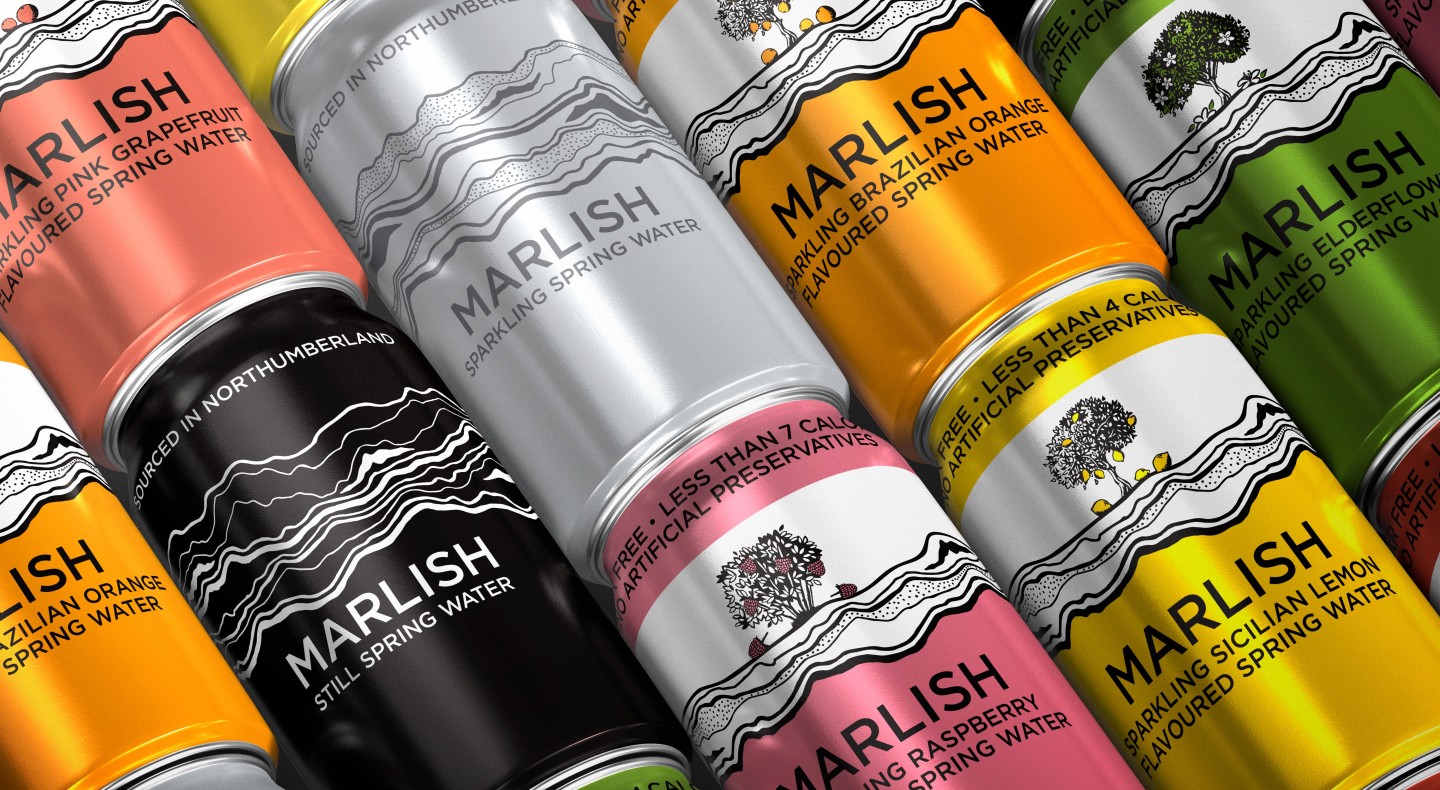
Over the years that we have worked with Marlish, the brand has evolved within a rapidly growing industry. From only a small selection of products, Marlish now has over 20 products including a wide range of mixers and flavoured waters in different sizes, packaged in both bottles and cans. For this reason, it was crucial for us to create a brand with elements that were easily adaptable to not only new packaging, print and digital marketing materials, but also to Marlish’s needs in the future. Marlish always had a connection to sustainability and wanting to be plastic-free. This value was incorporated into all design concepts.
Less is more
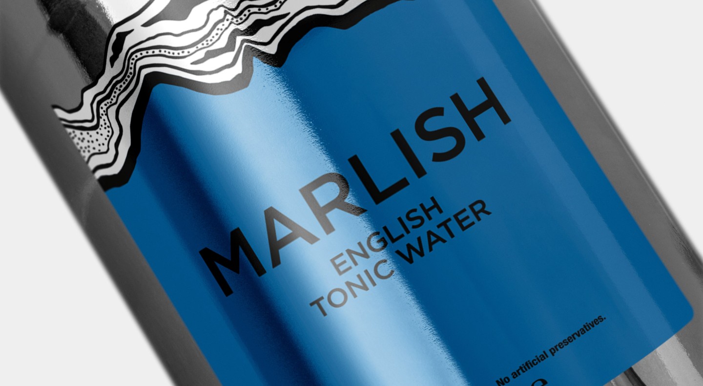
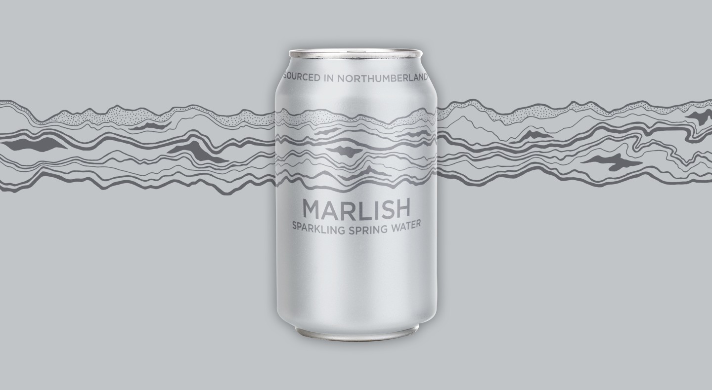
Part of the brand refresh included simplifying the current strata design. We originally hand-drew the strata when we began working with Marlish, as we wanted to give the brand a local, craft feel. However, as the brand has evolved to be recognised nationally, we decided it was time to give Marlish a more sophisticated look by not only refining and striping back the strata, but also by creating new packaging. The Marlish logo is already very minimalistic and therefore recognisable, but it was key to find a balance between the new labels displayed alongside it whilst also staying true to the previous designs to ensure everything still felt part of the same range.
Since the rebrand sales have increased by over 95%
Standing out from the crowd
When designing packaging, there are a lot of external factors that need to be considered. One of them is where the product is going to be displayed. In a sector where new products are launched every week, it is very difficult for a design to stand out on the shelf or in a bar.
With the new packaging designed for both the tonics and mixers bottles, it was essential that the brand was instantly recognised. By strategically placing the brand name higher up the label, we made sure it could be seen from behind the bar. We also gave each flavour a distinctive block of colour to ensure our target audience was able to identify the product instantly.
Looking for a partner to guide your next project?
Get in touch
You may also like
David Summerfield
Refreshing a family business brand, website and marketing activity
Read case study

