Linking nature’s therapy and mental wellness through design
National Trust’s Sky Gardening Challenge was created to connect Manchester’s city centre residents, who have limited access to nature, with green spaces. The project aimed to connect these selected individuals with the environment through an engaging competition.

Our partnership with National Trust
JUMP has partnered with National Trust for many years, particularly on projects related to the North East of England, which is how JUMP came to be involved in this pilot project. We were delighted to strengthen the partnership further with this interesting design task to help promote the Sky Gardening Challenge in 2024. National Trust approached JUMP with a clear vision paired with a requirement for a range of design materials, including print and digital designs. After the 2024 challenge, JUMP were invited back to help relaunch the same initiative in 2025.
Bringing gardening to city life
National Trust tasked us with curating a unique style for the project, delivering high-quality, premium and visually engaging materials that work across various formats. All material produced needed to adhere to National Trust’s well-established brand guidelines, all the while trying to reach a new urban target audience.
The brief stated there was a mission within the design to highlight the competition participants’ journey as they brought nature into their city-situated outdoor spaces. The design materials for the project also needed to convey the personal touch of participants’ individual stories and anecdotes. This would help to enhance engagement and allow individuals to see themselves in the materials, encouraging them to participate.
Looking for a partner to guide your next project?
We have loved working with JUMP, they understood how to balance our brand with an updated look that would appeal to a new audience and bring to life the Sky Gardening Challenge. No task was too small and the communication and turnaround was quick and precise.
Elin Rossiter, Project Manager

Collaboration was key
This project thrived on collaboration between JUMP and National Trust as it was essential our design team interpreted the brief in their own way, while keeping important touches from National Trust. National Trust initially provided us with a mood board to guide the concept. Additional necessities for the design were consideration of accessibility in colour and size throughout.
We engaged with project coordinators and stakeholders within National Trust at every opportunity, to ensure buy-in throughout the design process. Despite some challenges with the imagery to use in the designs, the end product matched the envisioned style, leading to a very well-matched brief to final outcome and a successful campaign for the client.

Impactful style linking to mission
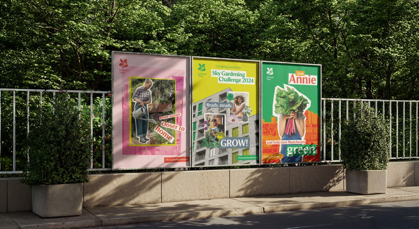
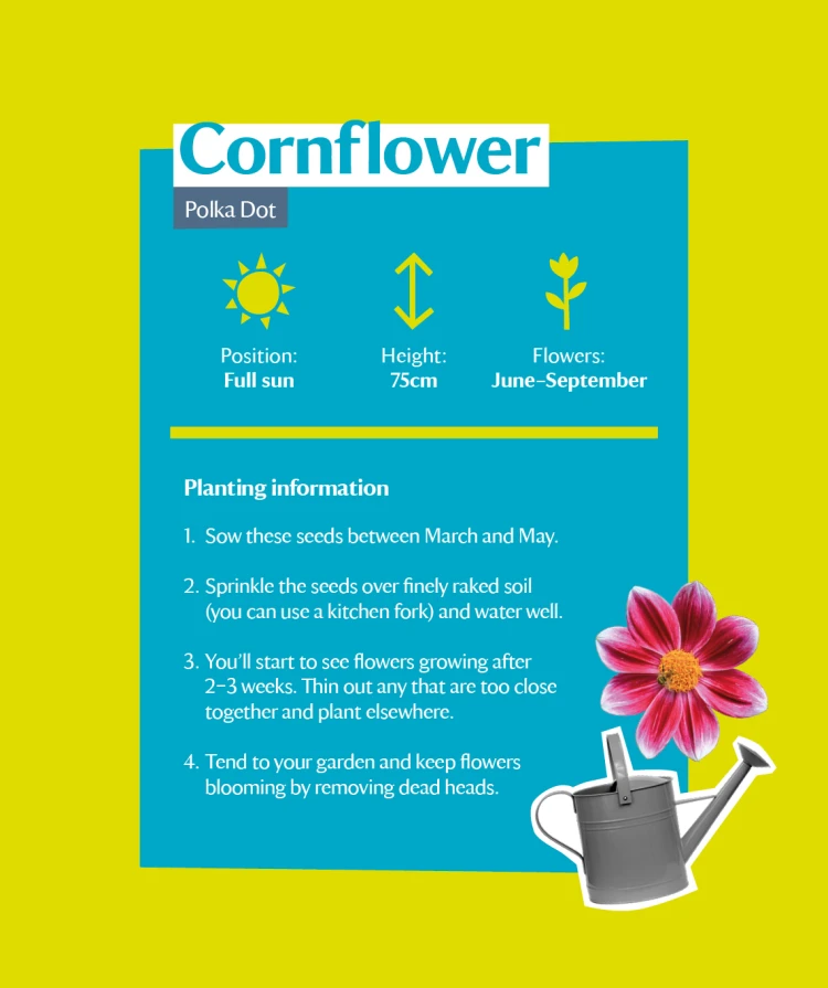
The style of the designs featured elements of collage, needing to portray a feeling of DIY linking to the overall theme of the competition. The bold colour used was specific to create impact and a range of bright colours was utilised to represent inclusivity, representing diverse people and places, again linking back to the mission of the project. The overall style created by our design team acts as a bridge connecting nature with urban areas all while utilising diverse personal style and preferences.
Layered levels of edginess for interpretation
The previously mentioned challenge with imagery occurred due to the project being a pilot, meaning previous imagery did not exist for usage. This meant that appropriate stock imagery had to be sourced and used, which posed a challenge in these unique designs. The imagery also utilised Adobe Photoshop to bring nature into people’s hands (literally) and to structure backgrounds to combine buildings and greenery.
The colours used were bold, vivid and majorly fell under the umbrella of the primary colours. Our design team created a rule to only use two to three colours together at one time to create continuity throughout. Overall, we aspired for the tone of the project to feel bold, gritty and heavily layered yet easy to understand with an edgy feel.
Interested in working with our design team?
A project with a deeper meaning
The final materials created for this manifold project were flyers, posters, certificates, seed packets, leaflets, digital boards, graphics within an app and a welcome booklet.
This campaign was bright and bold through the use of colour and collage techniques, which is somewhat distinct from our usual projects. JUMP was drawn to this campaign not just because of the unique design aspect, but also the behind-the-scenes mission it was aiming to achieve. We were proud to support a cause and use design to engage individuals to participate, which led to improved mental health and green spaces within urban city life.


